
SVG文档
SVG文档由<svg>根元素和基本形状元素(用于定义圆形、矩形、简单或复杂的曲线)构成。还有一个<g>元素,用来把若干基本形状编成一个组。SVG支持渐变、旋转、滤镜效果、JS接口等功能。
1. 基本属性
version 和 baseProfile: 用于确定SVG版本,是必不可少的。<object>: 可以通过该元素引用SVG文件viewBox: 定义画布上可以显示的区域,从(0, 0)点开始, 100宽*100高的区域。这100的区域,会放到200*200的画布上显示,形成了放大两倍的效果。- SVG里的属性值必须用引号引起来
1
2
3
4
5
6
7
<svg version="1.1"
baseProfile="full"
width="300" height="200"
viewBox="0 0 100 100"
xmlns="http://www.w3.org/2000/svg">
</svg>
<object data="image.svg" type="image/svg+xml" />
2. 基本形状
矩形
(x,y) 矩形左上角的位置, width height宽高, rx ry圆角的半径1
<rect x="10" y="10" width="30" height="30" rx="10" ry="10" />
圆形
(cx, cy) 圆心的位置, r 圆的半径1
<circle cx="25" cy="75" r="20" />
椭圆
(cx, cy) 椭圆中心的位置, rx ry 椭圆的x,y半径1
<ellipse cx="75" cy="75" rx="20" ry="5" />
直线
(x1, y1) 起点的位置, (x2, y2) 终点的位置1
<line x1="10" x2="50" y1="110" y2="150" />
折线
points=”x1 y1, x2 y2, x3 y3” 点集数列1
<polyline points="60 110, 65 120, 70 115, 75 130, 80 125, 85 140, 90 135, 95 150, 100 145" />
多边形
points=”x1 y1, x2 y2, x3 y3” 点集数列,路径最后一个点自动回到第一个点1
<polygon points="50 160, 55 180, 70 180, 60 190, 65 205, 50 195, 35 205, 40 190, 30 180, 45 180" />
3. 路径
d: 命令+参数的序列,关于如何绘制路径的信息。命令方式 : 一种用大写字母,表示采用绝对定位。另一种用小写字母,表示采用相对定位。
3.1 直线命令
1 | <path d="M10 10 H 90 V 90 H 10 Z" fill="transparent" stroke="black"/> |
3.2 曲线命令
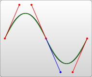
3.2.1 三次贝塞尔曲线
如果S命令跟在一个C命令或者另一个S命令的后面,它的第一个控制点,就会被假设成前一个控制点的对称点。如果S命令单独使用,前面没有C命令或者另一个S命令,那么它的两个控制点就会被假设为同一个点。1
2
3<path d="M10 10 C 20 20, 40 20, 50 10" stroke="black" fill="transparent"/>
// C x1 y1, x2 y2, x y | (x1,y1)起点的控制点, (x2,y2)终点的控制点, (x,y)曲线的终点
// S x2 y2, x y | 简写
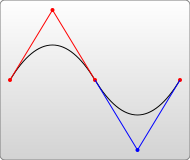
3.2.2 二次贝塞尔曲线
T命令前面必须是一个Q命令,或者是另一个T命令,控制点为前一个控制点的对称点。1
2// Q x1 y1, x y | (x1,y1)控制点, (x,y)终点
// T x y | 简写
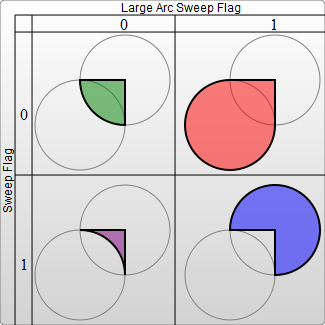
3.2.3 弧形
1 | // A rx ry x-axis-rotation large-arc-flag sweep-flag x y |
4. 填充与边框
上色 : stroke, fill, stroke-opacity, fill-opacity
1
2
3
4
5<rect x="10" y="10" width="100" height="100" stroke="blue" fill="purple"
fill-opacity="0.5" stroke-opacity="0.8"/>
// 使用CSS设置fill和stroke
<rect x="10" height="180" y="10" width="180" style="stroke: black; fill: red;"/>描边 : stroke-width, stroke-linecap = “butt/square/round”, stroke-linejoin = “miter/round/bevel”
1
2<polyline points="40 60 80 20 120 60" stroke="black" stroke-width="20"
stroke-linecap="butt" fill="none" stroke-linejoin="miter"/>虚线 : stroke-dasharray 数列用来描述虚线
1
2<path d="M 10 75 Q 50 10 100 75 T 190 75" stroke="black"
stroke-linecap="round" stroke-dasharray="5,10,5" fill="none"/>
5. 渐变与图案
线性渐变
在SVG文件的<defs>元素内部,创建一个<linearGradient>节点。<linearGradient>中的(x1,y1) (x2,y2) 定义了渐变路线走向。1
2
3
4
5
6
7
8
9
10<svg width="100" height="100" version="1.1" xmlns="https://www.w3.org/2000/svg">
<defs>
<linearGradient id="Gradient1" x1="0" x2="0" y1="0" y2="1">
<stop offset="0%" stop-color="red" />
<stop offset="50%" stop-color="black" stop-opacity="0.1" />
<stop offset="100%" stop-color="blue" />
</linearGradient>
</defs>
<rect x="10" y="10" width="100" height="100" fill="url(#Gradient1)"/>
</svg>径向渐变
从一个点开始发散绘制渐变。
spreadMethod : 当渐变到达终点,但此时尚未被填充完。可以设置spreadMethod, pad最终的偏移颜色被用于填充对象剩下的空间。 reflect让渐变一直持续下去,但效果与渐变本身相反。 repeat跳回最初的颜色然后继续渐变。1
2
3
4
5
6<defs>
<radialGradient id="RadialGradient1" cx="0.5" cy="0.5" r="0.25" fx="0.25" fy="0.25" spreadMethod="repeat">
<stop offset="0%" stop-color="red" />
<stop offset="100%" stop-color="blue" />
</radialGradient>
</defs>图案
<pattern>需要放在SVG文档的defs内部。pattern定义了一个单元系统,在pattern元素内你可以包含任何基本形状。1
2
3
4
5
6
7<defs>
<pattern id="Pattern" x="0" y="0" width="0.25" height="0.25">
<rect x="0" y="0" width="50" height="50" fill="blue"/>
<rect x="0" y="0" width="25" height="25" fill="url(#Gradient1)">
</pattern>
</defs>
<rect fill="url(#Pattern)" stroke="black" x="0" y="0" width="100" height="100">
6. 文本
<text>属性
(x,y)位置, text-anchor(文本流的方向):start/middle/end/inherit, fill, stroke, font-family, font-style, font-weight, font-variant, font-stretch, font-size, font-size-adjust, kerning, letter-spacing, word-spacing, text-decoration。
<tspan>属性
(x,y), (dx,dy), rotate(所有字符旋转一个角度), textLength,
<tref>元素
允许引用已经定义的文本,使用xlink:href属性,把它指向一个元素,取得其文本内容。
<textPath>元素
利用xlink:href属性取得一个任意路径,字体会环绕路径走。1
2
3
4
5
6
7
8<text id="example">This is an example</text>
<path id="my_path" d="M 20,20 C 40,40 80,40 100,20" />
<text x="10" y="10">
<tspan font-weight="bold" fill="red">Hello</tspan>
<tref xlink:href="#example"/>
<textPath xlink:href="#my_path">Hello</textPath>
</text>
7. 变形,剪切,遮罩
变形
1
2
3
4
5<rect x="0" y="0" width="10" height="10" transform="translate(30,40)">
translate(30,40) // 平移: 把矩形移动到点(30,40)
rotate(45) // 旋转: 指定旋转角度数
skewX(40)、skewY(40) // 斜切: 制作一个斜菱形
scale(0.5) // 缩放剪切
<clipPath>擦除已经创建的元素的部分内容,如绘制半圆1
2
3
4
5
6<defs>
<clipPath id="cut-off-bottom">
<rect x="0" y="0" width="200" height="100" />
</clipPath>
</defs>
<circle cx="100" cy="100" r="100" clip-path="url(#cut-off-bottom)" />遮罩
1
2
3
4
5
6<defs>
<mask id="Mask">
<rect x="0" y="0" width="100" height="100" fill="url(#Gradient1)">
</mask>
</defs>
<rect x="0" y="0" width="100" height="100" mask="url(#Mask)">嵌入图像
1
<image x="0" y="0" width="10" height="10" transform="rotate(45)" xlink:href="1.png"/>
可嵌入任意XML
8. 动画
9. SVG Animation
Animation is done by manipulating the attributes of shapes over time. This is done using one or more of the 5 SVG animation elements:<set> <animate> <animateColor> <animateTransform> <animateMotion>
<set>
The shape is not continuously animating, but just changes attribute attribute value once after a specific time. The example above sets the attributerto 100 after 5 seconds.1
2
3
4
5<svg width="500" height="100" version="1.1">
<circle cx="30" cy="30" r="25" style="fill: #0000ff;">
<set attributeName="r" attributeType="XML" to="100" begin="5s"/>
</circle>
</svg><animate>
Theanimateelement is used to animate an attribute of an SVG shape. You nest theanimateelement inside the shape you want it applied to.
This example animate thecxattribute of the<circle>element from a value of 30 to the value of 470. The animation starts at 0 seconds, and has a duration of 5 seconds. The animation repeats indefinitely.1
2
3
4
5
6
7<circle cx="30" cy="30" r="25" style="stroke: none; fill: #0000ff;">
<animate attributeName="cx" attributeType="XML"
from="30" to="470"
begin="0s" dur="5s"
fill="remove" repeatCount="indefinite"
/>
</circle><animateTransform>
The<animateTransform>element can animate thetransformattribute of a shape.
The example animates thetransformattribute of the<rect>element it is nested inside. Thetypeattribute is set torotatemeaning the animated transformation will be a rotation. Thefromandtoattributes set the parameters to be animated and passed torotatefunction. This example rotates from a degree of 0 to a degree of 360 around point 5,5.
1 | <rect x="10" y="10" width="10" height="10" |
<animateMotion>
The<animateMotion>element can animate the movement of a shape along a path.
In order to rotate the square to align with the slope of the path, you can set therotateattribute of the<animateMotion>element toauto. You can also set therotateattribute to a specific value, like 20 or 30 etc. That will keep the shape rotated that number of degrees throughout the animation.1
2
3
4
5<svg width="500" height="100" version="1.1" xmlns="http://www.w3.org/2000/svg">
<rect x="0" y="0" width="30" height="15" style="stroke: #ff0000; fill: none;">
<animateMotion path="M10,50 q60,50 100,0 q60,-50 100,0" begin="0s" dur="10s" repeatCount="indefinite" rotate="auto"/>
</rect>
</svg>

- Time Units
h, min, s, ms, hh:mm:ss
Coordinating Animations
Thebeginattribute value is set toone.endwhich means that this animation should start when the animation with the idoneends. You can also specify offsets to start or end time of another animation, likeone.begin+10s.1
2
3
4
5
6
7
8
9
10<rect x="0" y="0" width="30" height="15" style="stroke: #ff0000; fill: none;">
<animate id="one" attributeName="x" attributeType="XML"
from="0" to="400"
begin="0s" dur="10s" fill="freeze"
/>
<animate attributeName="y" attributeType="XML"
from="0" to="50"
begin="one.end" dur="10s" fill="freeze"
/>
</rect>Repeating Animations
There are two attributes you can use inside an animation element which are used to repeat the animation.
The first attribute is therepeatCountattribute. You can set a number of times, or the valueindefinitewhich will keep the animation running without ever stopping.
The second attribute is therepeatDurwhich specifies a duration for which the animation is to be repeated.1
2
3
4
5
6
7<animate attributeName="y" attributeType="XML"
from="0" to="50"
begin="one.end" dur="10s" fill="freeze"
repeatCount="3"
// repeatCount="indefinite"
// repeatDur="30s"
/>Combining Animations
You can combine animations by listing more than one<animation>inside the element to animate.
When combining<animateTransform>elements, the default behaviour is for the second animation to cancel out the first. Howeve, you can combine the transformation animations by add the attributeadditivewith a value ofsumto both<animateTransform>elemens.
Here is an example which both scales and rotates a rectangle.1
2
3
4
5
6
7
8
9
10
11
12
13
14
15
16
17<rect x="10" y="10" width="40" height="20" style="stroke: #000000; fill: none;">
<animateTransform attributeName="transform" attributeType="XML"
type="scale"
from="1" to="3"
begin="0s" dur="10s"
repeatCount="indefinite"
additive="sum"
/>
<animateTransform attributeName="transform" attributeType="XML"
type="rotate"
from="0 30 20" to="360 30 20"
begin="0s" dur="10s"
fill="freeze"
repeatCount="indefinite"
additive="sum"
/>
</rect>
10. SVG Scripting
Via scripting you can modify the SVG elements, animate them, or listen for mouse events on the shapes.
10.1 Changing attribute values
Here is a simple SVG scripting example which changes the dimensions of an SVG rectangle when a button is clicked.
1 | <svg width="500" height="100"> |
10.2 Event Listeners
You can add event listeners to an SVG shape directly in the SVG if you want. You do so just like you would with an HTML element. You can also attach an event listener to an SVG element using the addEventListener() function.1
2
3
4<rect x="10" y="10" width="100" height="75" style="stroke: #000000; fill: #eeeeee;"
onmouseover="this.style.stroke = '#ff0000'; this.style['stroke-width'] = 5;"
onmouseout="this.style.stroke = '#000000'; this.style['stroke-width'] = 1;"
/>
10.3 Animating SVG Shapes
In order to animate an SVG shape you need to call a Javascript function repeatedly. The function changes the position or dimensions of a shape.
1 | <svg width="500" height="100"> |